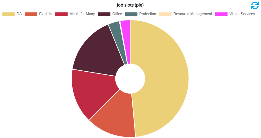
Other dashboard feeds are best represented by charts: percentages of slots open by job is much more useful in chart form rather than a listing. Chart-based dashboard feeds can use one of two generators: "Chart.js" or "Chartist". Unless told otherwise, you should always use "Chart.js".
Show title outside of chart |
If checked, shows the chart title in an HTML |
Title link to full-size chart on separate page |
Checking this will make the chart's title a hyperlink to show the chart again, full page, on a separate page. |
Responsive |
If set to Responsive, the chart will attempt to resize itself based on changes in the device size and/or orientation. |
Chart type |
"Bar chart (horizontal)", "Bar chart (vertical)", "Line chart", "Pie chart". |
Color scheme |
Sets the color ranges used for the chart; see dashboard chart color schemes. |
Legend position |
"Top", "Left", "Right", "Bottom", or "No legend". |
Doughnut, Doughnut hole size, Stack bar items, X-axis label, Y-axis label |
These are all dependent on the Chart type selected. |
Fill transparency |
Sets how opaque or not the colored regions of the chart are. |
Chart width, Chart height |
"Bar chart (horizontal)", "Bar chart (vertical)", "Line chart", "Pie chart" |
"Loading" text |
This text will show in place of the chart during the loading. |
Data field |
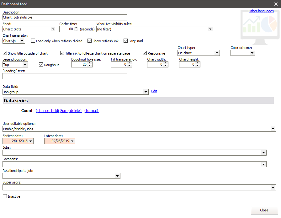
From the source data, what field forms the primary category? In the example below, "Job group" is used as the segments of the pie. |
Data series |
From the source data, what should be summarized? In this case we're taking the Count (number of volunteers required) and summing that. |
For unreadably complex descriptions of how Chart.js works, and with detailed explanations of the internals of how settings above apply, see the Chart.js documentation.

Based on this example, this is what you might see in VSys Anywhere.